Creating Bar Charts with Gnuplot
As part of the work on my thesis, I'm currently analysing lots of log files that show the access patterns to the Semantic Web Dogfood linked data server. At the end, I want to auto-generate nice-looking bar charts from them which show usage over time. Having generate lots of csv files (using a combination of Webalizer, standard Unix commands like sed and grep, and finally some Ruby scripting), my first idea was to do this with Excel. However, while it is certainly possible and easy enough to generate one chart with Excel, I couldn't see an easy way to do it in batches (maybe with AppleScript?). So I decided to use gnuplot, which, while it has a higher learning curve, is so much easier to configure and automate.
Installation was easy enough on Mac OS 10.5. I tried a MacPorts port first, but unfortunately that just generate lots of errors during the installation process. As a last resort, I tried installing gnuplot from source (I'm always a little scared of doing that...) - and it worked like a breeze! I had expected it to be the other way around…
Anyway, after going through some short tutorials and the gnuplot documentation, I finally came up with this plot to generate the bar charts, which reads its data from a 'numbers.dat' file:
#our dat file looks like this:
##   date    hits   files   pages  visits   sites  kbytes
#20081126    1854    1080    1811     246     136   18060

# we want the x-axis to be a time line
set xdata time

# by default, the x-axis is defined by the first column in the
# .dat file.  the format of our dates is like "20081230", we
# need to tell gnuplot about that:
set timefmt "%Y%m%d"

# rotate the labels on the x-axis by 90°
set xtics rotate

# set the
set term postscript eps color blacktext

# we want to output the plot to a file:
set output "hits.eps"

# we want to generate solid looking bars for our bar charts, so
# we tell gnuplots to use a solid fill style
set style fill solid 0.5

# now plot the second (hits) and third (files) column from our
# data file, using boxes instead of the default crosses
plot "numbers.dat" using 1:2 title 'hits' with boxes,\
     "numbers.dat" using 1:3 title 'files' with boxes
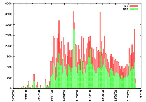
And the output is:
P.S.: Very handy for editing the plot file is the gnuplot bundle for TextMate.
posted by Knud Möller @ 1/23/2009 05:20:00 pm
4 comments
![]()